Case Study
Cult Furniture
Revamped Cult's branding and website for consistency, engagement, and improved user experience across web and mobile.
Year
2021
Role
UI/UX Designer · Brand Designer
Company
Cult Furniture
Platform
Web · Mobile · Brand
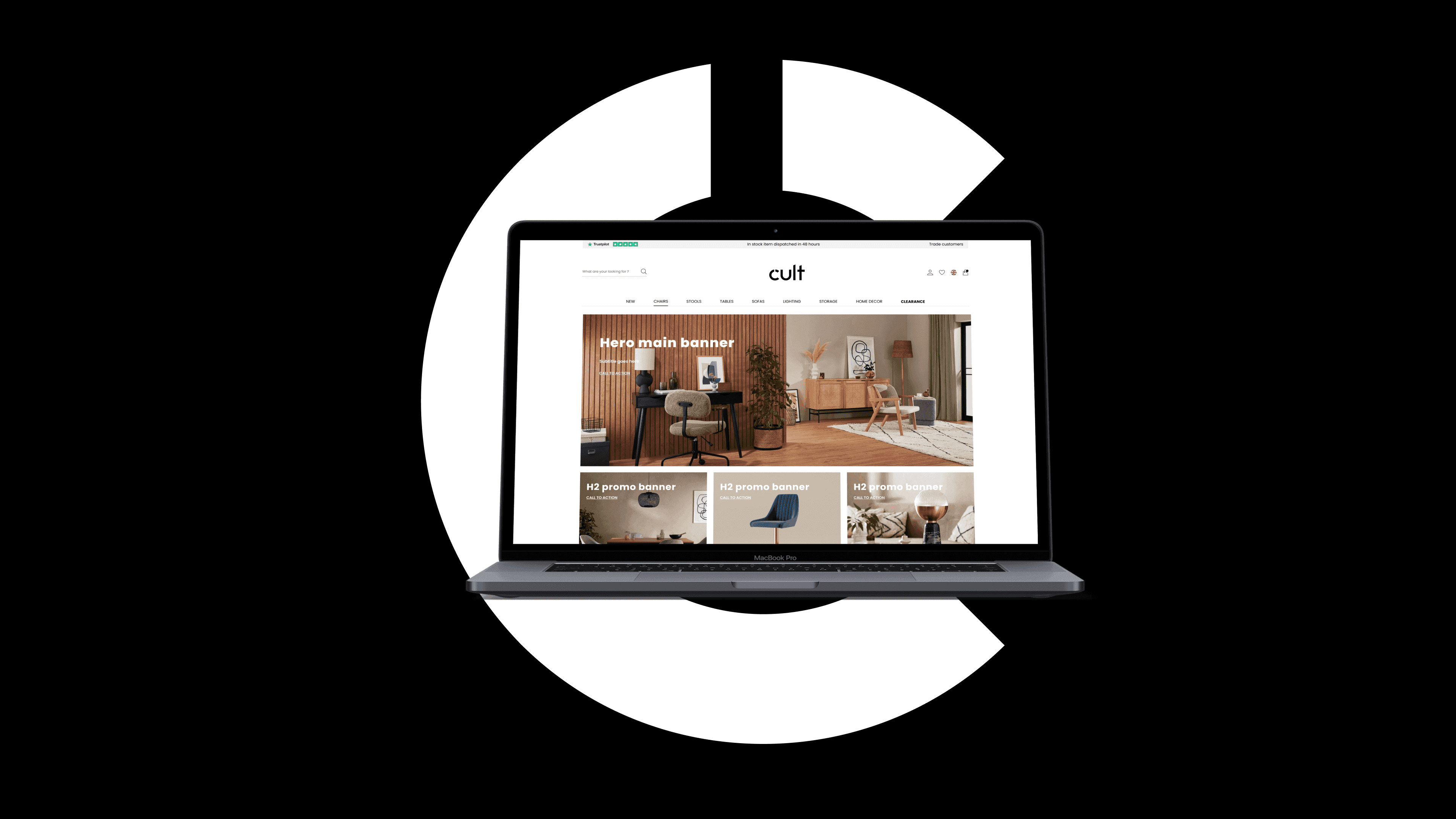
Overview
Cult is a fresh and dynamic furniture brand, bringing stylish furniture and home decor to young professionals and design-conscious individuals. Our brand identity expresses who we are and should be instantly recognisable to our customers. By consistently applying our brand across all communications, we reinforce what sets us apart from our peers. Cult aims to create fresh, dynamic designs that are as affordable as they are stylish, offering modern and innovative interiors for the fashion-forward.
My Role
UI/UX Designer · Brand Designer
Scope
Brand identity, web redesign, email marketing, social media
Platform
Web (desktop & mobile)
Tools
Figma, Photoshop, Illustrator
Defining the Brand
Cult (noun)
“A person or thing that is popular or fashionable among a particular group or section of society.” — “the series has become a bit of a cult in the UK”.
synonyms: craze, fashion, fad, vogue
The reduction of the name ‘Cultfurniture’ to simply ‘Cult’ took place as a way to create a shorter brand, something more coherent with the values the company carries at its core: a modern, dynamic, young brand that isn't just about selling furniture, but one specialised in stylish, design-led home decor. Beyond the reduction in name, the goal was to be instantly recognised by its own consumers.
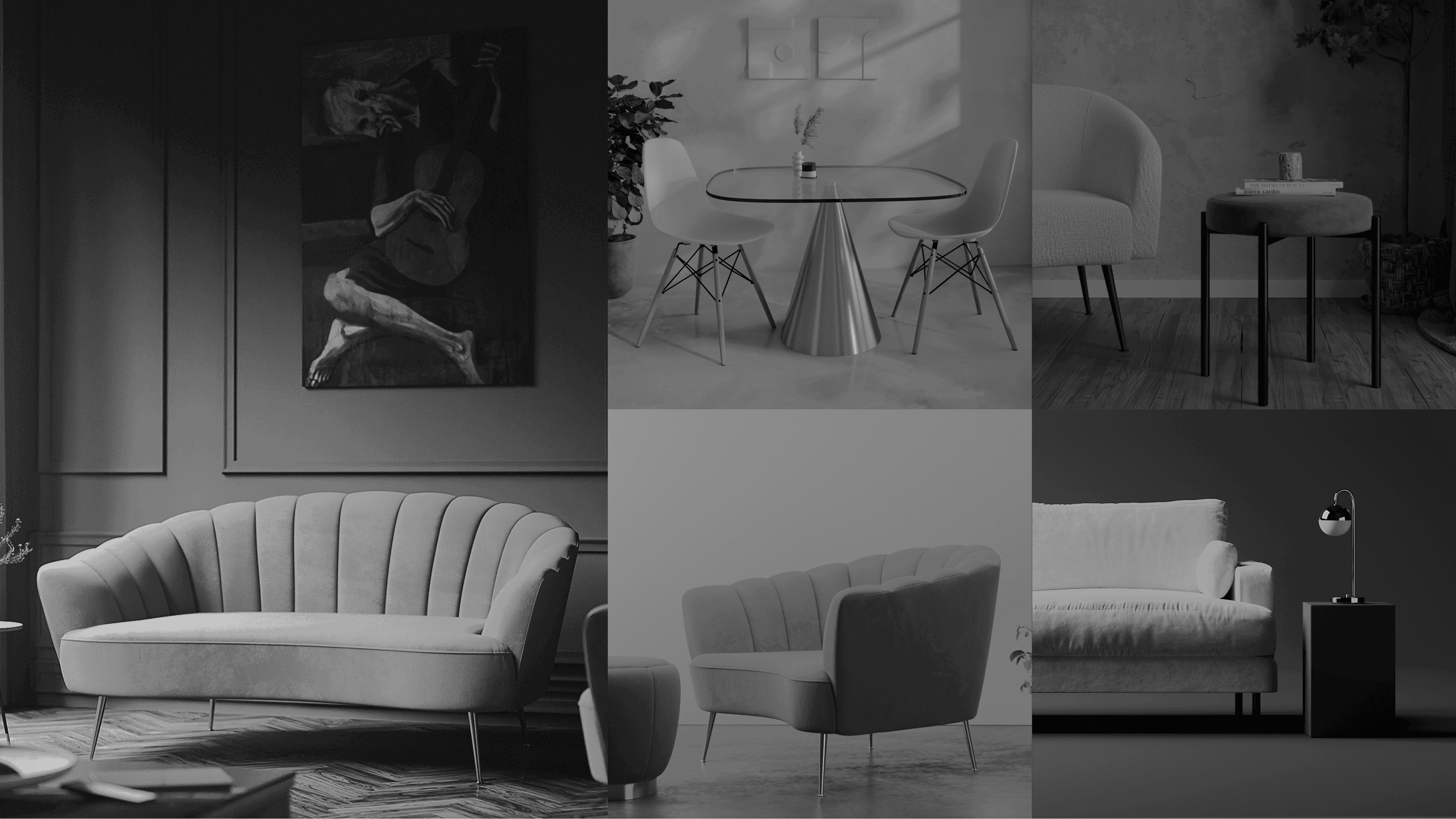
Brand direction: 'Design a life you love'
Problem
A brand without a visual language
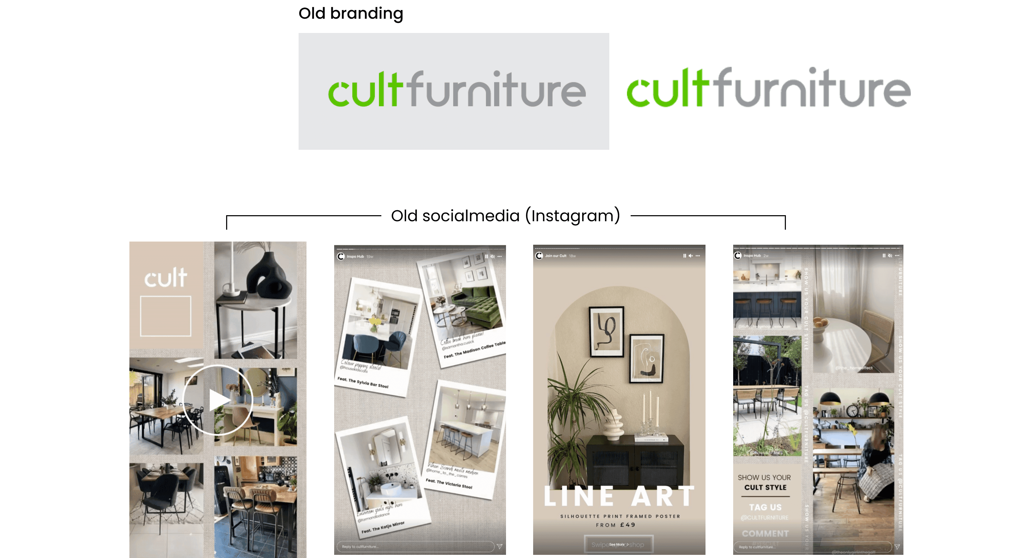
For many years, the colour green was the official colour of the Cult Furniture e-commerce platform. But the difficulty in applying the colour, combined with changes in brand concept, constant problems of application in digital media and especially packaging, and the absence of a visual identity manual, caused a serious problem of inconsistency, visual unity and brand fragility.
The lack of visual consistency was compounded by the communication channels working the brand independently: not only with different visuals, but with entirely different tones of voice. This generated confusion among customers navigating between the company's different omni-channels.
Newsletters, a very important tool for the company with a high impact on sales numbers, lacked visual consistency with the brand, tone of voice and layout, totally disconnected from any cohesive brand idea. Through analytics, we proved low performance in open rates: the poor user experience and unattractive look gave users no compelling reason to open and click.
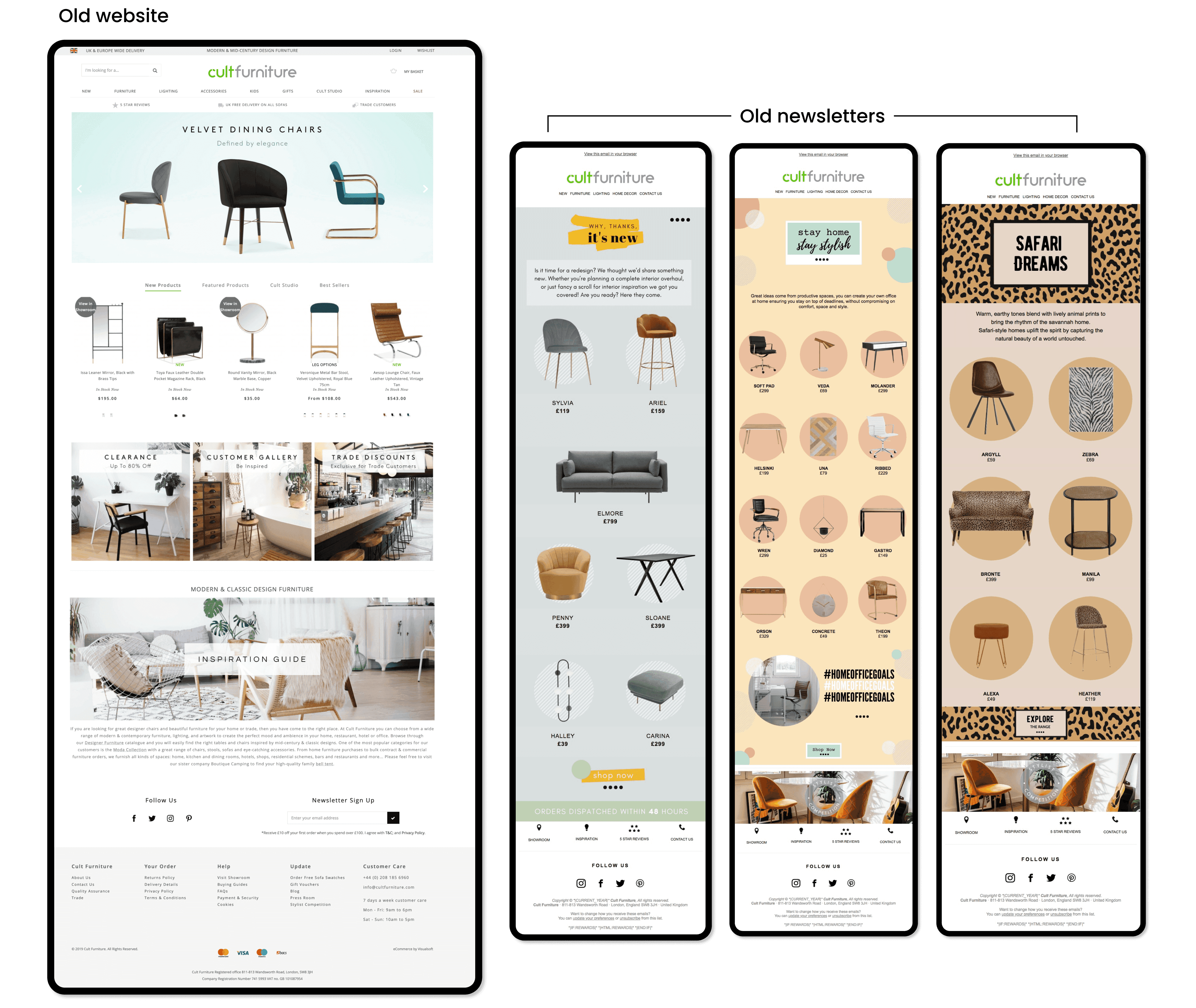
No visual identity manual: every touchpoint interpreted the brand differently
The original homepage: a complex navigation bar with no card-based discovery
Research & Strategy
Understanding the market and the user
After research with heatmapping, we discovered that more than 60% of navigation happened below the fold, between the main banner and the recommendations carousel. This revealed the need to better explore this region of the site, increasing engagement for other navigation sections and promoting hero products through three new banners below the main banner, as well as using them for smaller promotional campaigns.
Thinking about improving the experience for users who relied on the navigation bar and search, we set out to create a card-based navigation system with the main, most-accessible categories, updated with fresh content regularly, encouraging customers to scroll down to see what's new on the homepage.
Finally, we added a social gallery to the homepage, connecting Instagram with the site for the first time, and reduced the number of categories in the main carousel to keep only the options with the greatest impact and interaction.
Benchmarking
Benchmarking helped us analyse competitors and map their products and services. We gathered important insights into features, functions and flows, and a better understanding of the furniture e-commerce market — helping us make focused decisions and identify the main gaps in our own product.
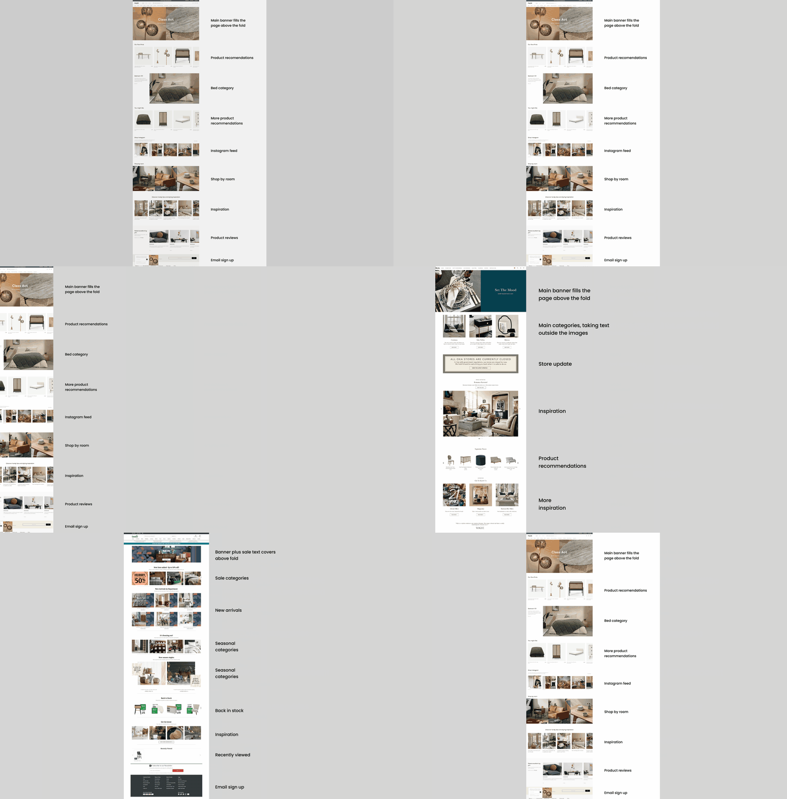
Benchmarking Cult against Made.com, Swoon, OKA, Barker & Stonehouse, West Elm and Habitat
Typography
Our brand font is Poppins
Poppins comes in many weights. We use it to convey strength and style while improving the readability of information, reducing the risk of misunderstanding the content. Headlines are set in Poppins Semi-Bold or Bold; body copy uses Regular or Semi-Bold to create sub-headers for visual hierarchy.
Typography is used to establish visual hierarchy: BOLD styles for titles and REGULAR for body copy and CTAs. Most furniture companies aren't in a beauty competition — they focus on user experience, letting users get to the information they need as quickly as possible and guiding them to checkout. The brand's objective is never to confuse customers or hinder their journey; the buying experience should be as seamless as possible.
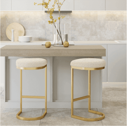
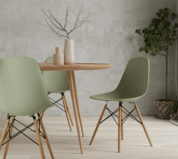
Poppins in application
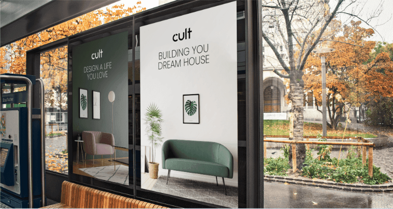
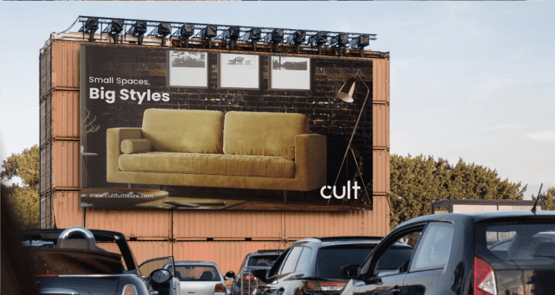
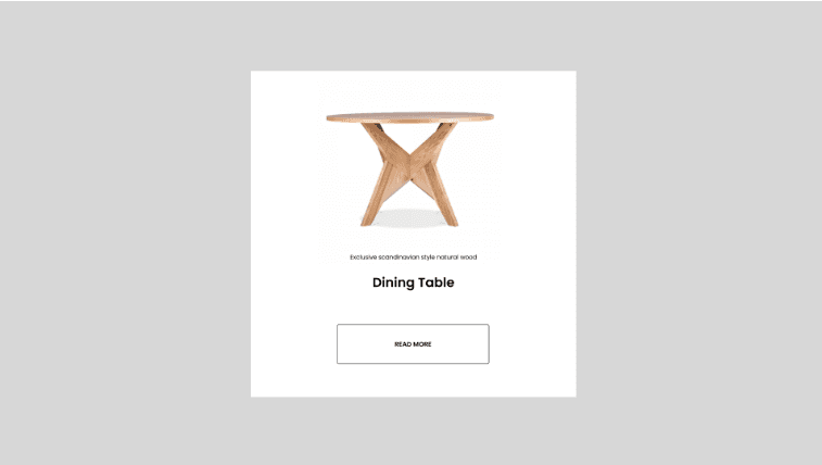
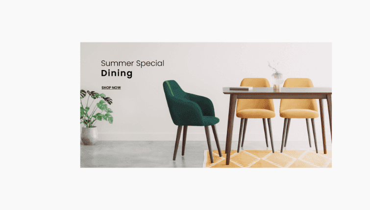
The full type family used across the brand system, carrying the same clarity and warmth from the homepage hero to a single product card — keeping the tone confident, modern and easy to read at any scale.
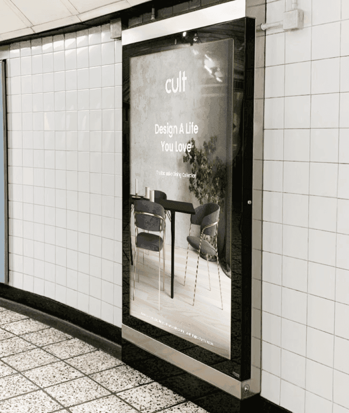
Stylescape
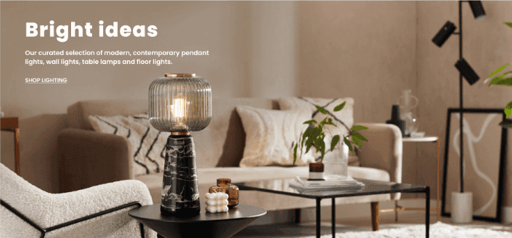
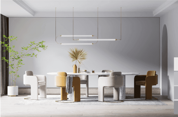
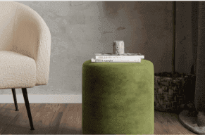
Simplicity, natural materials, soft tones
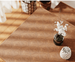
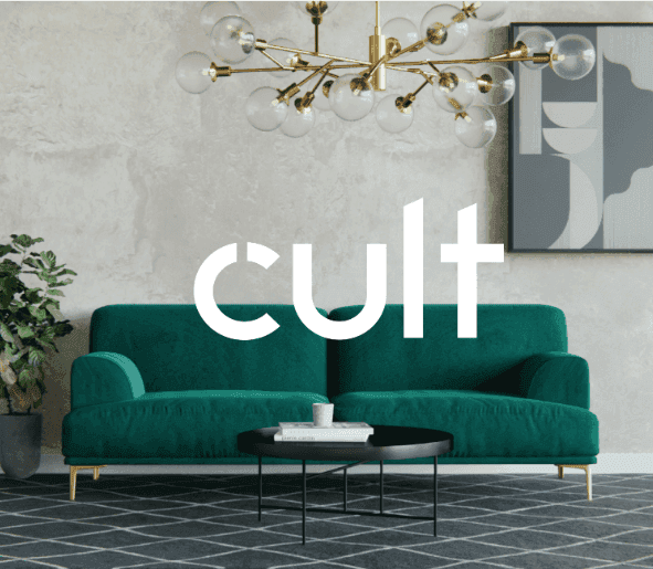
Simplicity, punctuated with natural materials, soft tones and deep accents, creates a sense of functional design that can adapt to any context — from the homepage hero to a single product card.
Key problems identified
- No visual identity manual, so each team interpreted the brand independently
- Green colour was impossible to apply consistently across digital and print
- Newsletter open rates were low due to poor visual appeal and inconsistent tone
- More than 60% of users browsed below the fold, and the homepage wasn't capitalising on this
- Navigation relied entirely on a complex bar, with no visual card-based discovery
Brand principles defined
- Simple · Clean · Fresh · Adaptable: let the products do the talking
- Imagery: clean, unobtrusive backgrounds, no mixing of lifestyle and 3D in the same asset
- Poppins as brand font: Semi-Bold for headlines, Regular for body copy
- Reduce categories in the carousel to the most impactful ones only
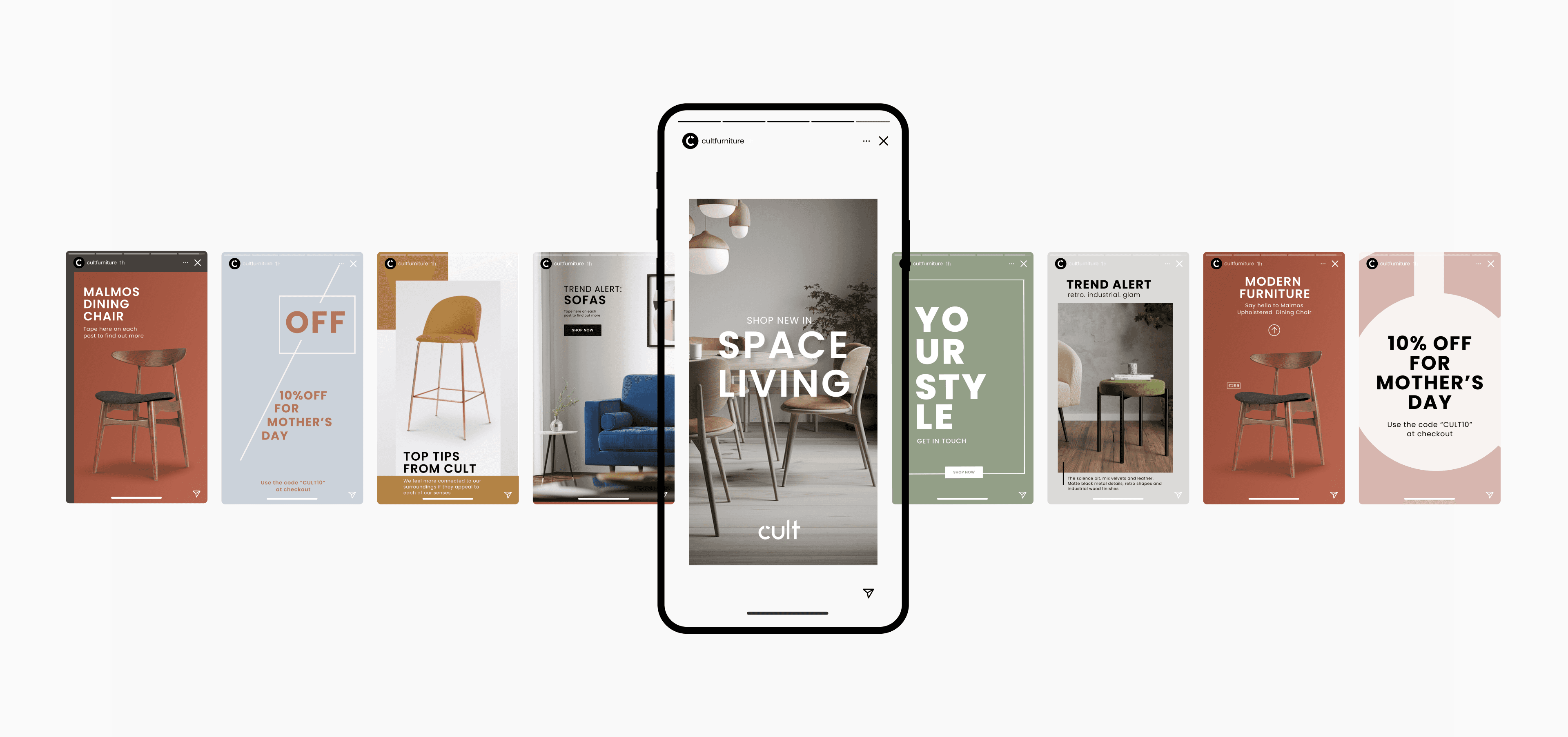
- Consistency across all omni-channel touchpoints: web, mobile, email, social
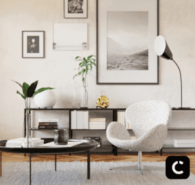
'Let the products do the talking' — 3D or lifestyle imagery, never mixed in the same asset
Imagery follows the same principle: clean and simple, with focus on the product rather than distracting props. Clean, unobtrusive backgrounds let titles and content overlay effectively without obstructing the product, and keep the homepage from feeling busy — while still giving the brand freedom to adapt to new trends.
Design Process
From wireframe to solution
Through the results collected by the e-commerce department in A/B tests, heatmaps, competitor analysis and analytics, we structured a new homepage with product recommendations below the fold, plus three new promotional banners boosting hero products and small campaigns.
The redesign moved from low-fidelity wireframes to high-fidelity prototypes tested with real users, iterating on heatmap data and A/B test results from the e-commerce team. Every decision was anchored in performance data rather than aesthetic preference alone.
01 · Wireframe
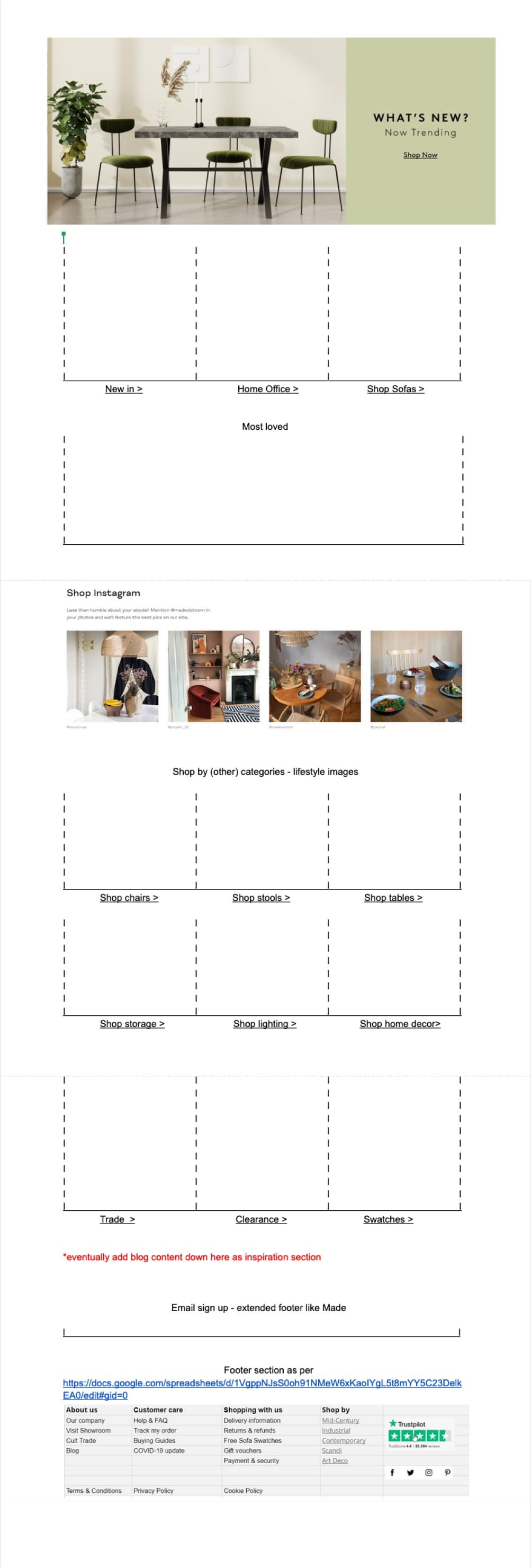
Low-fidelity structure mapping the new homepage: hero, three promotional banners and a card-based category system.
02 · Low fidelity
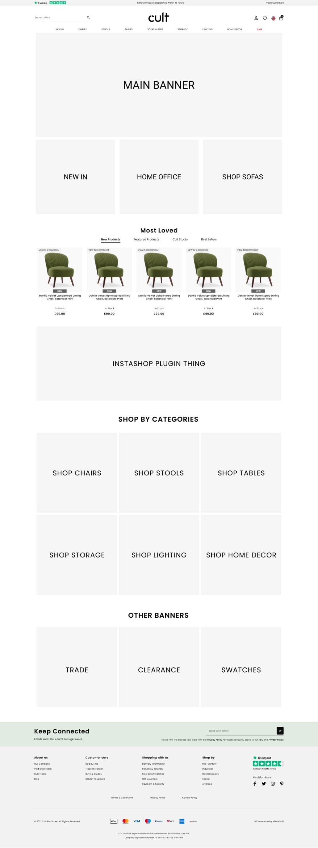
Greyscale layouts used to validate hierarchy and flow with the e-commerce team before applying the brand.
03 · Prototype
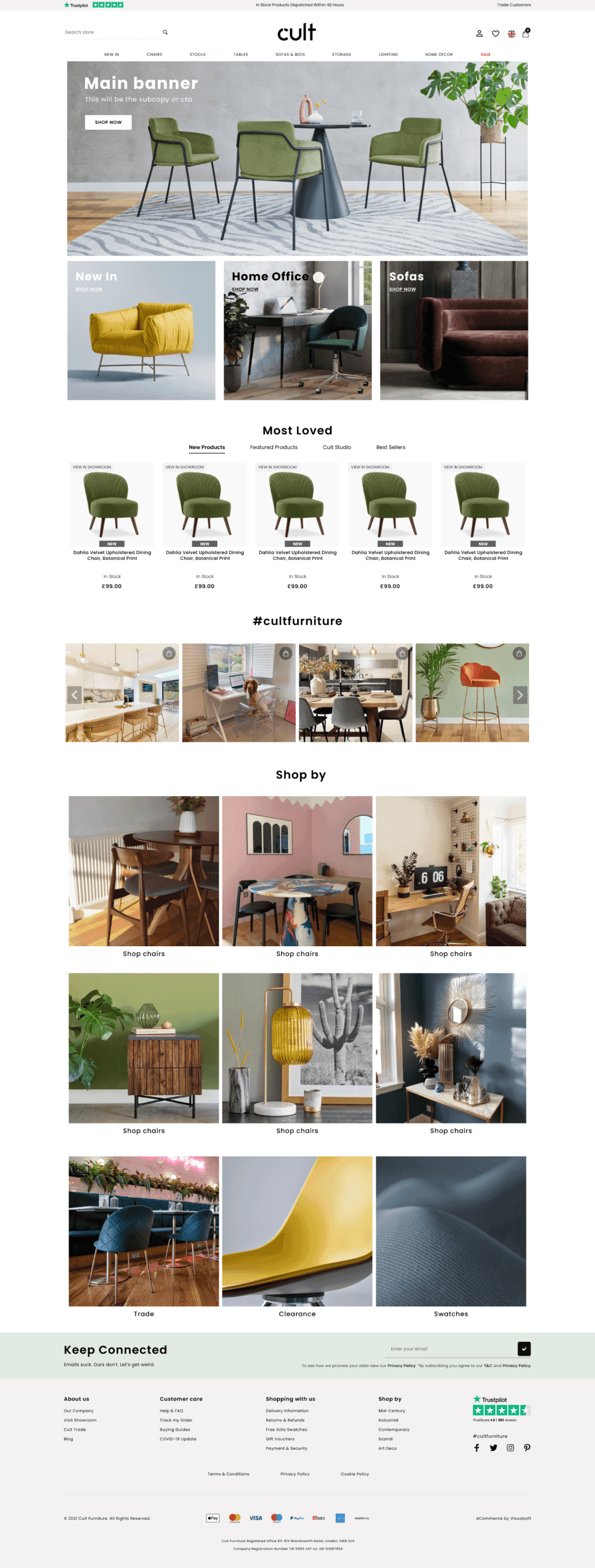
High-fidelity prototype tested with real users and iterated on heatmap data and A/B test results.
The Solution
Simple, clean, fresh and adaptable
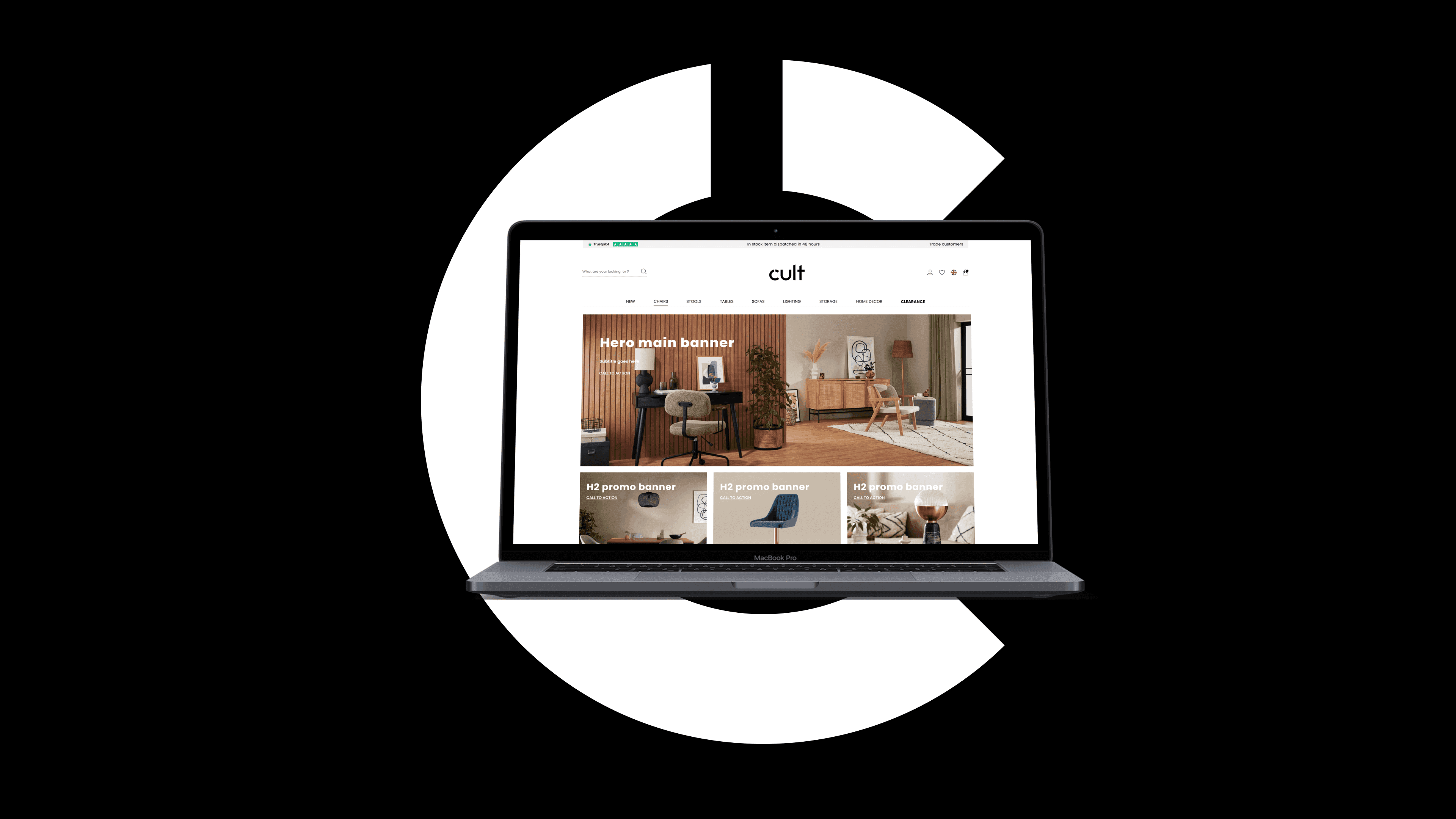
The redesigned homepage introduced three promotional banners below the main hero banner, directly addressing the under-exploited below-the-fold zone. A new card-based navigation system replaced the traditional bar for category browsing, updated dynamically and encouraging scroll-based discovery.
A social gallery was added to connect Instagram content directly with the homepage, creating a live editorial feel. Newsletter templates were rebuilt from scratch with consistent layout, Cult's new tone of voice, and clear visual hierarchy.
The brand refresh extended across homepage, mobile, social media and newsletters, creating a unified brand experience for the first time. The result: instantly recognisable to Cult's customers wherever they encountered the brand.
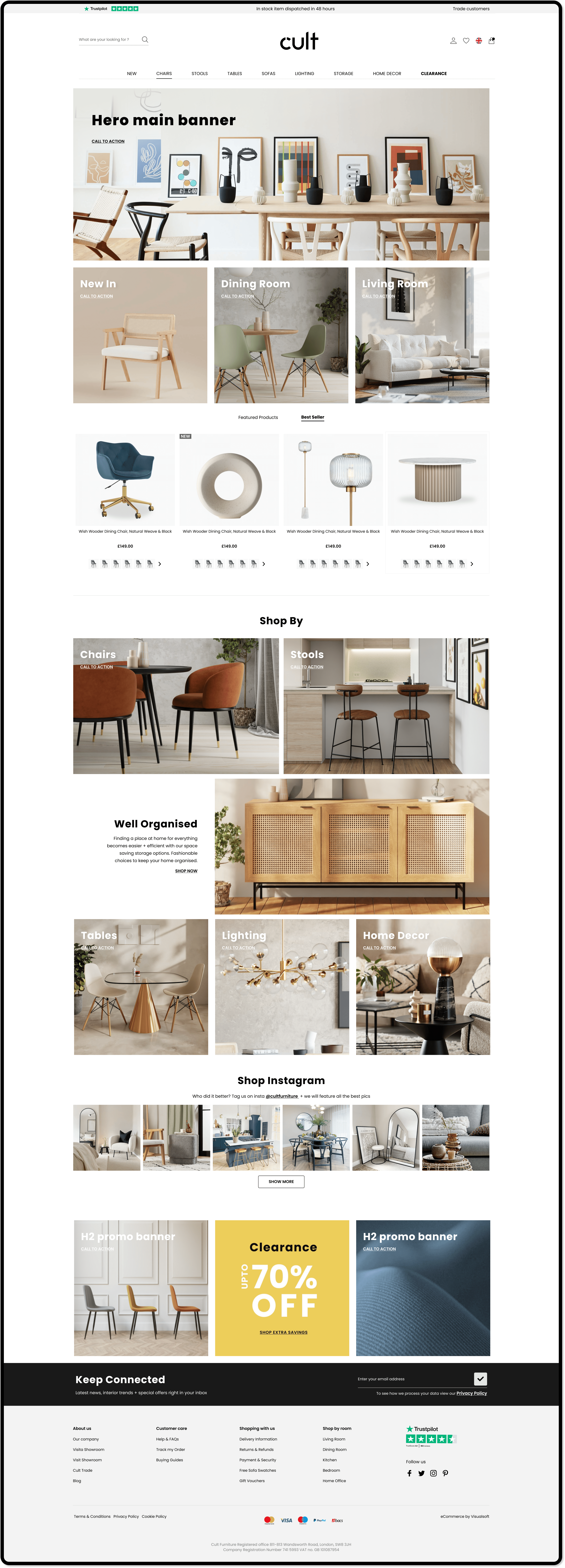
Homepage: full-page scroll showing hero, promo banners, card navigation, carousel and social gallery
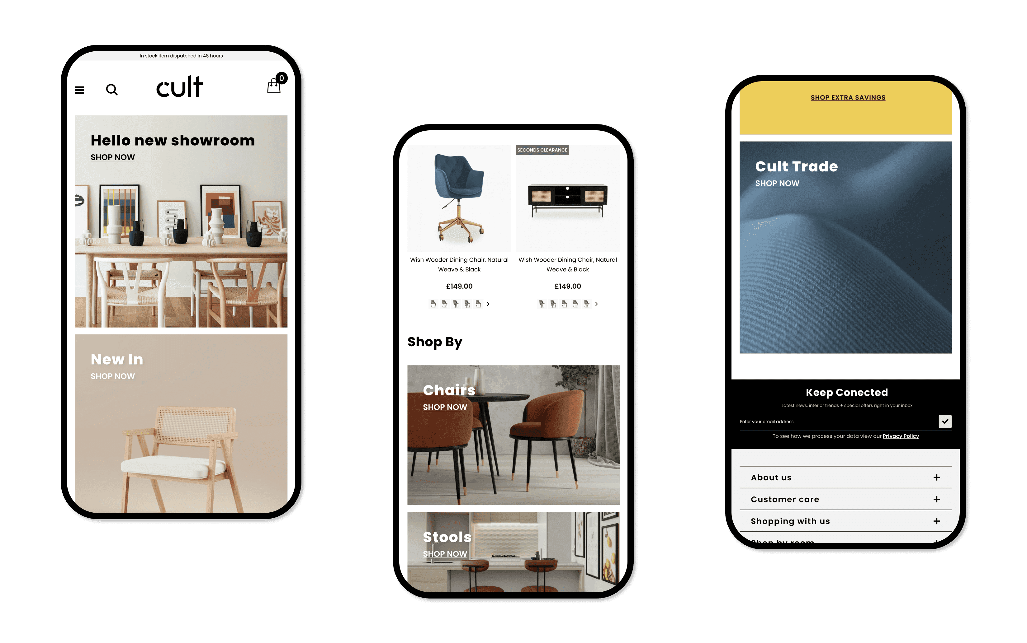
Mobile: the same visual language adapted for touch and smaller breakpoints
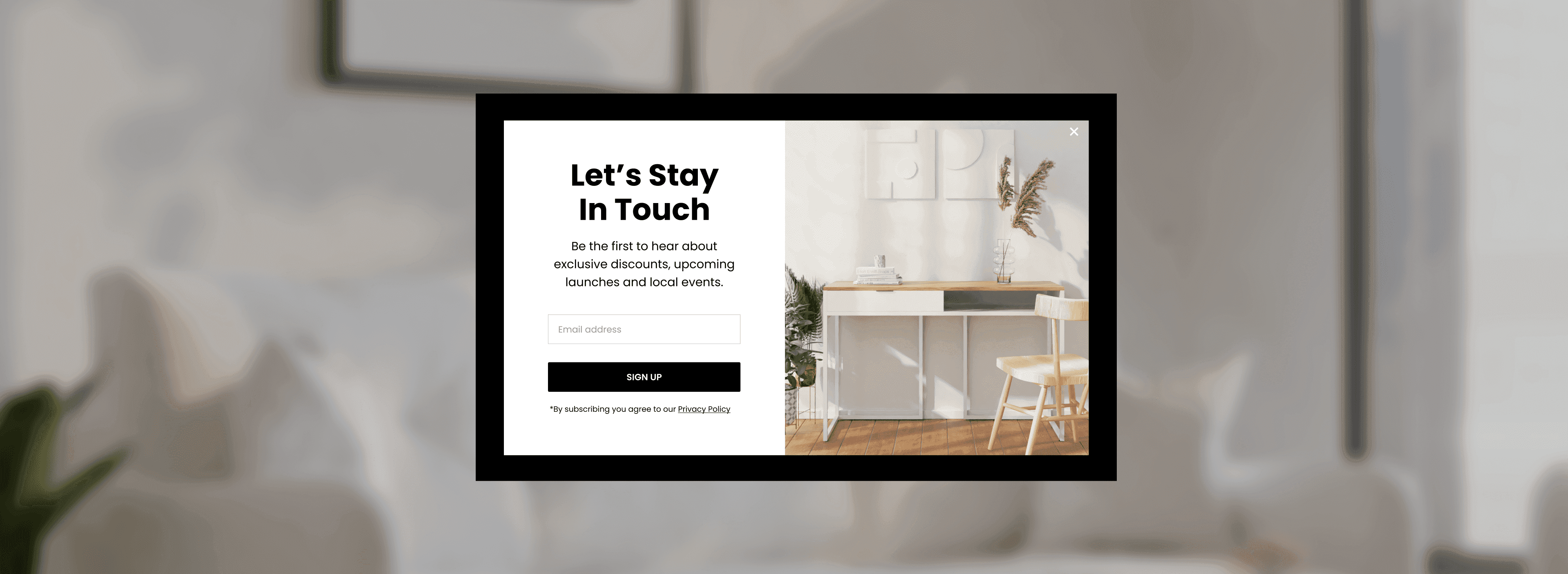
Social media: consistent tone of voice and imagery guidelines applied to organic and paid posts
Newsletter: templates rebuilt from scratch with consistent layout and clear visual hierarchy
Next Project